In order to understand the type of genre which my music video falls under I have to get to grips with the vast catalogue of music magazines available to consumers around the UK. There are just under 130 different types of music magazines available in todays market, so, where does magazine should feature my music video? Below are 2 different magazines I have researched which may feature my music video.
Q Magazine
Part of Bauer Media Group, Q Magazine are one of the biggest selling music magazines in the UK and have featured all different kinds of music genres in the past, however focus mostly on Indie and Rock genres. The magazine has an extensive review section, featuring: new releases, reissues, music compilations, film and live concert reviews, as well as radio and television reviews.
I believe that because Q Magazine don't just concentrate on one type of genre, a number of different genres are able to be advertised within the magazine, including my chosen music artist 'Fenech Soler'. Because my chosen are artist are an Indie-pop band, I feel that they wouldn't look amiss within Q Magazine. I have also researched that Fenech Soler have featured within Q Magazine previously showing that I chose correctly.
NME Magazine
I believe that my chosen artist 'Fenech Soler' could feature in NME because the magazine aims at promoting the indie genre, which is ideally the type of genre Fenech Soler are. I also believe that they target the same type of audience, I have already researched that my chosen artists target audience is young adults (17-21 year olds) and having researched NME have discovered that it also targets the same audience.
RESEARCH: MAGAZINES AND THEIR GENRE
 You walk into a local supermarket, go to the magazine section and what do you see? What you will find in most shops are the HUGE variety of different music magazines available to buy, there are just under 130 music magazines available to buy across the UK. So, how do you know which one to buy which will fit your preferred genre of music?
INDIE MAGAZINES
 Indie magazines are usually the most difficult magazine to decipher from the crowd of other magazines, this is because a lot of Indie artists dress and act quite differently because the term 'Indie' means Independent meaning they don't have a certain type of look unlike Rock or Pop. There are only a few verified indie music magazines within the UK, these include Q Magazine, NME, IndieMusicMag and TheWire, so what makes these Indie Magazines?. Firstly not only is it about the content inside the magazine, the cover has a huge impact and tells us a great deal about the type of genre which features within the magazine. Indie are a balanced proportion of things, for example they aren't too eccentric colors but not too dark or bland, instead what you will see are colors such as blue, brown, purple or orange. Another thing is the artists who are featuring on the cover. Some may automatically realise it's a Indie magazine because the artist is a well recognised person within the genre, secondly it is about the clothes they wear. Again Indie artists aren't too eccentric yet never really under dressed, what you would expect are usually smart casual characters on the front cover to represent the 'Independant' type of genre as it is quite stereotypical these days for indie artists to wear this type of clothing.
ROCK MAGAZINES
 Moving onto a much easier genre to recognise on the store shelves, the rock movement have over the years formed its own iconic identity compared to the Indie scene, There are various different Rock magazines available across the UK including Kerrang! and Rolling Stone, so how can you depict a rock magazine from the shop shelves? The rock genre usually associates itself with being more masculine and rebellious than any other type of genre, the type of font used would usually be more bold and distinct because it is one of the first things a consumer would see. Another thing is the colors used, because they associate themselves with rebellion, the colors used to represent that are usually blacks or reds, this is why most rock magazines use these colors, it also highlights the type of target audience they want to read their magazine, for example a middle aged man wouldn't pick up a magazine which was sparkly and pink, instead they'd go for the more masculine looking mag. Finally what would stand out would be the artists chosen on the front cover, the artist would look very masculine and scary, usually holding some sort of instrument, they would also wear dark colors to represent their masculinity and highlight the stereotypical view of rock artists.
RESEARCH: CODES AND CONVENTIONS OF MAGAZINE COVERS
Today I am looking at the different codes and conventions which make up a magazine cover. Because of the huge variety of different music magazines available I have narrowed down 2 magazines which I will analyze, these magazines are Q Magazine amd Kerrang! I will be looking at what makes the front cover of the magazine attractive and appealing to it's audience, also I will be looking at the stereotypical features which make up a general magazine cover.
Q MAGAZINE COVER

Font size: As you can see the font size differentiates throughout the front cover. The most outstanding piece of text would be the band name 'BLUR' which is centralised in the middle of the page and is much larger than the rest of the text. The reason why the cover editors have done this is to show the main talking point within the magazine, for example if a consumer was to walk past this in a shop. the first thing they'll notice is the band which Q Magazine are reviewing in the issue. This will help the sales of the magazine because people who are Blur fans will buy it alongside regular Q Magazine readers.
Colors: In this edition of Q Magazine, the colors which stand out the most are Red (logo), White (magazine background) and Gold. The colors are an important feature of the magazine cover because it makes the cover stand out from other magazines, it also highlights the type of music which will feature within the magazine, for example the color black will represent a gothic, rock genre band. In this case, the color white represents that the band are quite an upbeat type of band. The color gold could represent the age of the band, for example gold is usually often interpretated to be the color of old, antigue aged content. The color red is used for the logo, this is a good color to use because it is a bright and makes the logo stand out to a consumer.
Image: Stereotypically on music magazine covers, they would usually have an image of the artist/band which will be featuring within the magazine. This is a good idea because it will help boost sales as not only will regular Q Magazine readers buy it, people who are fans of the featured band/artist will also buy it because they had seen their image on the front and want to know more about their favourite band. On this edition, the band Blur feature on the front cover, this means that fans of Blur will want to buy the magazine.
Other text: On this front cover of Q Magazine, the other text which is not as important as the main heading 'BLUR' has featured in smaller text and around the side of the main text and image. This is because it is not as important as the main headline so instead the editor has made the text less obvious however large enough so that the consumer knows what else is within the magazine. The text has also been put around the side to make the cover look more neat so that the cover does not look confusing which may put a consumer off.
KERRANG! MAGAZINE COVER
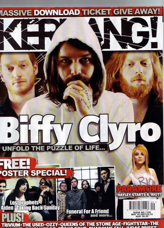
Font size: Again there is a variation of font size within the cover, the font size which stands out the most would be again the band name who are featuring within the magazine, this is so that consumers know who Kerrang! are featuring within their magazine, this in turn will attract more interest to their magazine.
Colors: Kerrang have followed a stereotypical suit of colors within their cover, because the magazine focuses on the rock genre, they have used colors such as black, red and white which are colors usually associated to the rock genre. This affects the type of consumer which will buy the magazine, for example a person interested in pop music wouldn't buy this type of music magazine because they have recognised the colors used on the front cover which are associated with rock.
Image: Yet again the image of the band 'Biffy Clyto' is the main feature of the magazine cover, this is because it is used to attract consumers who interested with the band to buy the magazine. The editors wanted the image to be the main feature of the cover so badly that they have used the image and overlaped the Kerrang! logo with it. This shows the magazines determination to make the band stand out to attract new consumers.
Other text: Finally the other text has yet again been placed around the main feature of the cover which is the image of the band, this is because the editors do not regard it to be the most interesting news which will attract a consumer to buy the magazine, however it is still important as it tells the audience what is the content within the magazine.
RESEARCH: KEY TERMS FOR THE CONVENTIONS OF MUSIC MAGAZINES
Recently I have been researching the different conventions which play a part in creating the cover of music magazines, however I was stuck in actually naming the different conventions. Today I am researching the different key terms which are used as conventions on a music magazine. Below are the list of different key terms I have found.

Main cover line - Often an artists title or important text placed on the cover
Drop capitals - Larger pieces of text compared to the majority of text.
Banners - text which stands out due to it being placed on a image or colored background
House style - The style of the cover which makes it distinctive and unique towards other music magazines.
Strap lines - The smaller headline placed below or around the main title.
Sell lines - A piece of text to try and sell the magazine to its audience
RESEARCH: WHY ADVERTISEMENT IS IMPORTANT TO MUSIC MAGAZINES
Music magazine are the main source of advertisement for brands such as Q, Kerrang and NME to source their product to it's audience. The other alternatvies such as social networking and TV advertismenet don't work as effectively as music magazines for the brands, this is due to a variety of possibilities such as the music magazine is more commenly distributed to shops across the UK meaning more people are able to access the magazine. I have been researching some of the magazine brands and have found I why they use their magazines as advertisement for their brand.

The reason I have decided to research the use of advertismeent within the music magazine is because I could add advertisement for my own music magazine cover for my chosen artisy. Hopefully if I do decide to then it will look more professional and reach out to the specific target audience I am looking for.
PRODUCTION: CREATING PRACTICE MUSIC MAGAZINE COVER
Today I begin the task of creating a practice music magazine cover on the software Adobe Photoshop. The reason why i am creating a practice is so that I understand the different concepts which are needed to be able to form the basis of the magazine cover. Below I have took print screens of the different stages I went through in order to complete my practice.

Firstly, in order for my magazine cover to be the ideal size, I had to change the format of the size of the canvas i'll be working on. To do this I clicked on..
File > New> Changed preset to 'International paper' > Change the size of the paper to 'A4'

Now I had a blank canvas, i was able to put anything I wanted on it. I found an image of google which I put on my canvas, I then changed the opacity of the image meaning the picture wouldn't stand out as much.

I then added a lighting effect to create a blue
circle in the middle of the image to attract attention.

I then added the title of the artist and the album name, I added some lighting effect on the text to make it stand out better.

I then added star ratings to my canvas, changing their colour to black and giving them a outer glow, then I added text of the rating name below or above.

Finally I added the album release date at the bottom and also their Facebook and twitter page.
Below is the first practice music advertisement I had made, I am very happy with the outcome as this was the first time I had created something like this on photoshop. I believe it matches the artists style quite well and the spotlight helps highlight the most important parts of the advert. If I was to improve it i would add more content such as tour dates or the album cover I will create.

To be able to experiment further, I have created a second practice advertisement on photoshop. I have used a completly different layout and 'look' to the advertisement, I hope to compare these two practice adverts together and get some feedback from my target audience which will give me a better understanding of what I need to improve for my final advertisement.

FINAL EDIT OF MAGAZINE ADVERTISEMENT
Below is my final edit of the magazine advertisement I have created on Adobe Photoshop, below I will show you the progression I went through in order to complete the advertisement.

 To begin with I used a plain wooden image as the background, reduced the opacity to 60% and then added a smoke effect across the background to get the smeared effect. I then found an appropriate font in which would headline the advertisement. Then added two rectangles and placed them under the title, added the NME logo and recoloured it to look more appropriate and then added stars to the side of the logo.
 Next I created the bottom part of the advertisement which would feature the tour dates and other information, I found all the logo's needed and recoloured them to look more appropriate, I then used the same text to add the tour places and resized them depending on its position. I then added another rectangle and split it in two and added the word 'live' in between.


Next I saved this image as 'displace.psd' this will come in handy later on when I displace the text around the face.
 The text will then needed to be added to the layer, I created a text box with the same aspect ratio as the image itself, I then filled the text box with the bands name 'fenech soler', I copied and pasted the word so it filled the complete picture.
Finally I made sure I was on the text layer, I clicked on filter> distort > displace and then uploaded the 'displace.psd' file I saved earlier. After this was complete, I played with the colors until I felt it was suitable to upload to my magazine advertisement.
No comments:
Post a Comment